Axiom is a design and illustration system built to reduce complexity and increase development speed —without compromising quality. In early 2019, Calendly was rapidly scaling but so was the complexity—more pages, more content, more illustrations, and it needed to happen quicker.
my role
Sole UX/Visual Designer
collaborators
Front-end developers, product marketing, PMs, QA
my role
Feb 2018 - Nov 2019
outcome
overview
I joined Calendly as the first visual designer and illustrator for marketing and web development team. As the only designer, I wore a lot of hats designing everything from conference booths for the marketing team, API's for the engineering team to employee branding for the recruiting team.
However, one of the major projects during this time was evolving the Calendly brand aesthetic which had not been changed since the company launched. I developed Axiom as a systematized approach to evolving Calendly’s design and illustration style balancing internal constraints with user needs.
+63%
conversion rate
+17%
page traffic
+23%
demo & sales leads
one month after launching redesigned pages
During a quarterly innovation day, I paired with a front-end engineer and product marketer to launch Axiom. After the innovation day, I worked closely with the marketing and engineering teams to bring this system to life to the pixel and word. We scaled the design process to other teams needing pages and content developed from business development, recruiting, and compliance.
challenge
In the early days, there was little hierarchy, process, or documentation to developing content for the marketing site. And as new pages and illustrations were added style inconsistencies started to arise.
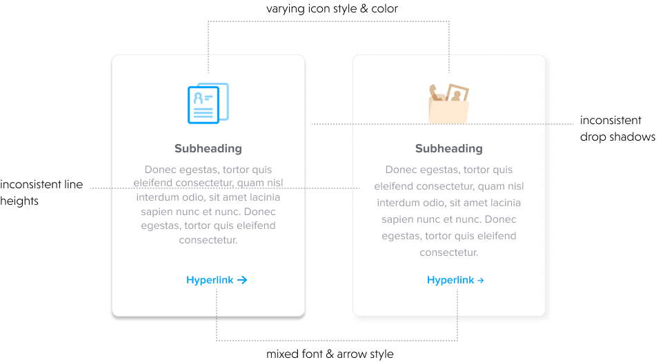
no common design language
research
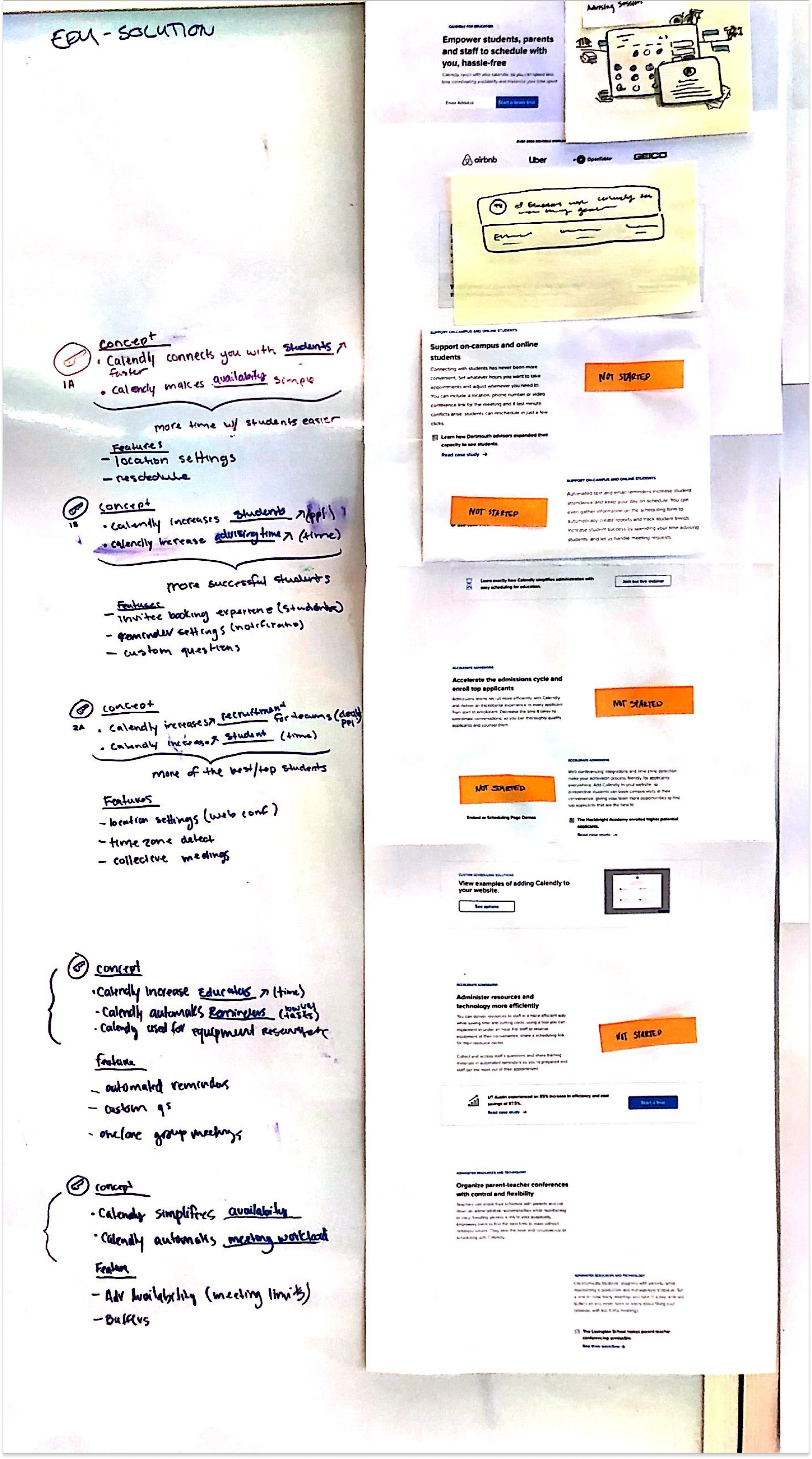
In the months before launching Axiom, I interviewed everyone I worked with from Marketing to QA to Customer Experience digging into what were the painpoints in the current process. I talked to users on their experience on the marketing site. I attended conferences on design systems (twice!). I audited every icon, illustration, and UX pattern on the site. I published internal documentation on site usage patterns and accessibility.
airtable illustration audit excerpt
transparency & governance
This research revealed stakeholders across marketing, product, and engineering had difficulty understanding the entire development pipeline causing delays and development difficulties. One of they key parts of Axiom’s launch was communicating the design to development process and creating a sense of shared ownership.
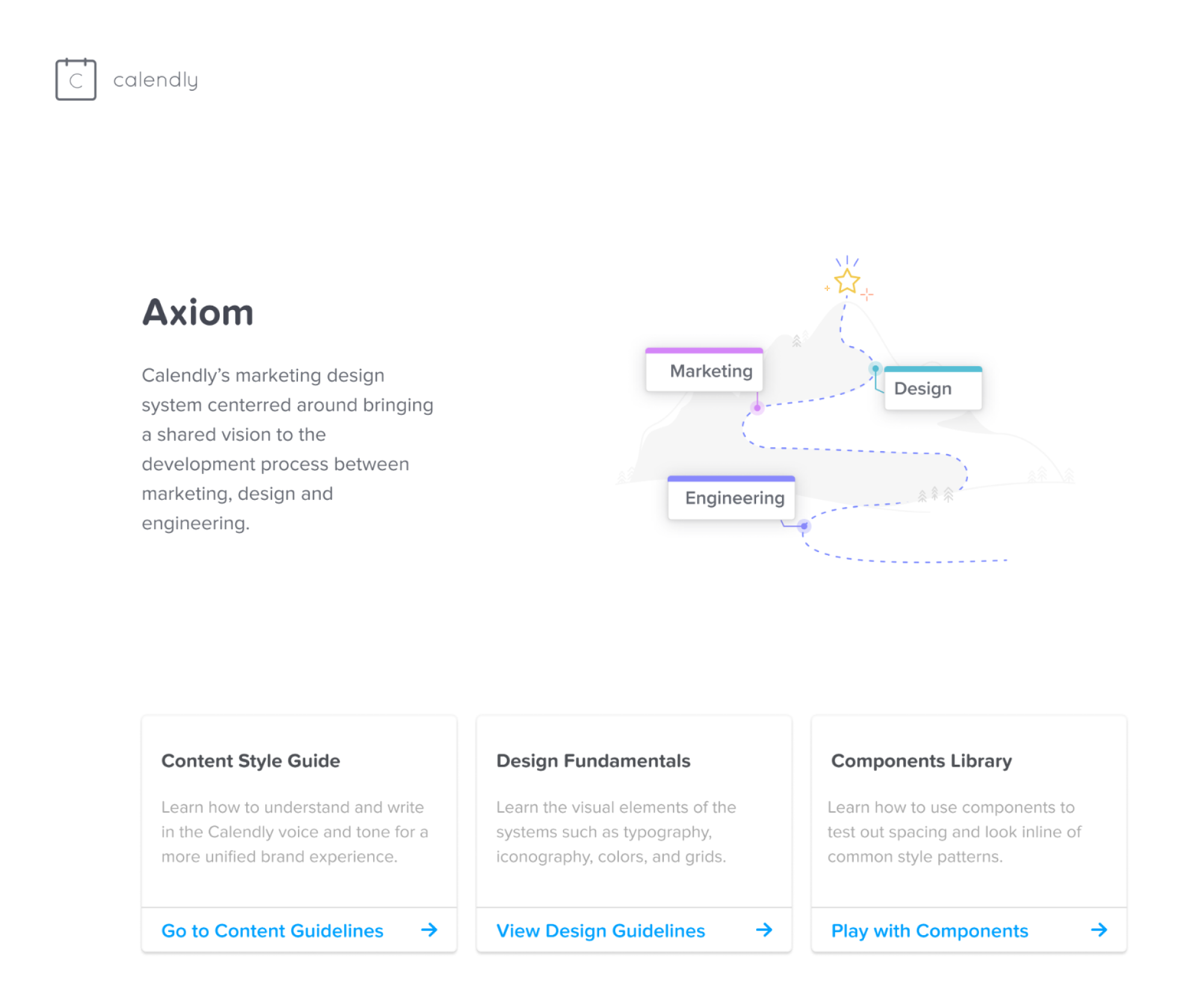
internal landing page on guidelines for developing new content
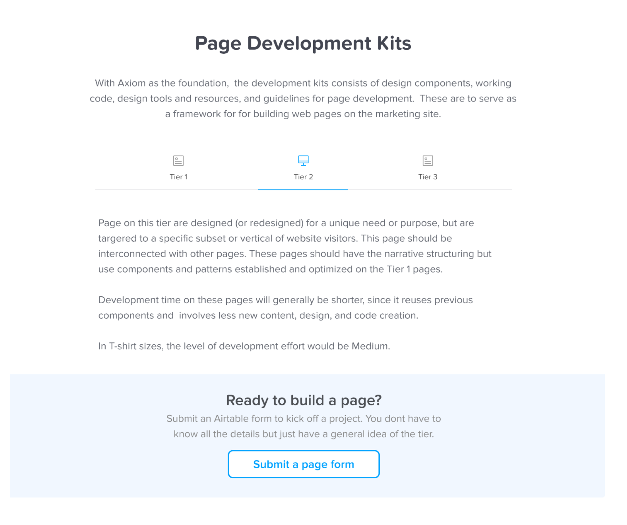
setting expectations with a clear design to development process
live component library for testing input interactivity
system design
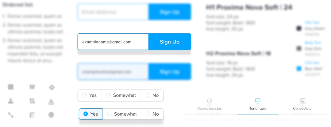
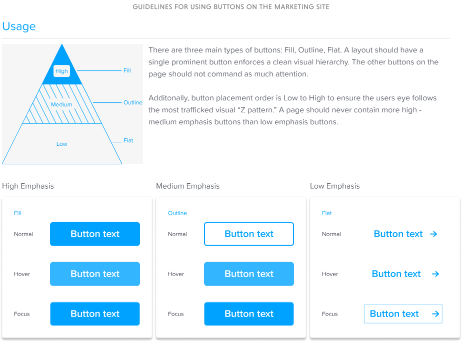
After auditing the current patterns, I identified key areas for updating the brand style. As the new kid on the block, the Calendly brand needed an updated feel without a complete overhaul. Using Brad Frost’s Atomic Design methodology and IBM’s Carbon design system as a reference, I methodically defined everything from vertical spacing standards based on content type to defining button style hierarchy. I pushed to move the marketing design work from Sketch to Figma to make use of Figma’s native design system capabilities.
guidelines for using buttons on the marketing site
guidelines for ensuring consistent spacing across pages and content
guidelines for ensuring accessibility
Axiom differs from product design systems. I had to split from conventional methods to design a system that updated more dynamically to fit the needs of the marketing team. I designed the modules with a style agnostic approach. Each module type captured a common UX pattern on the site and then defined possible adaptations for a given scenario using illustration and icons.
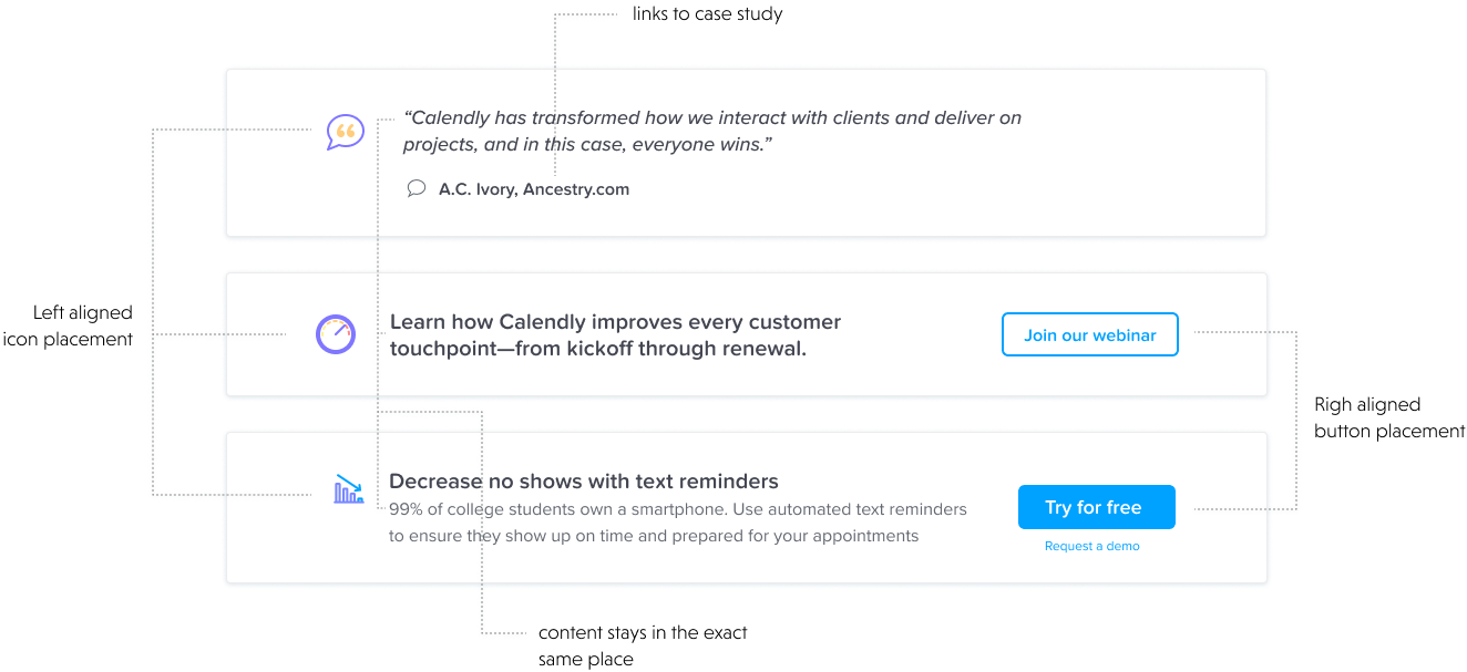
card based scenarios
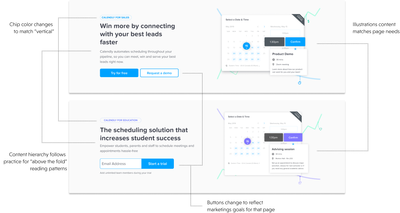
page header scenarios
illustration system
Starting with the audit, I categorized each illustration and icon style and created guidelines for line width, size, color, and narrative.
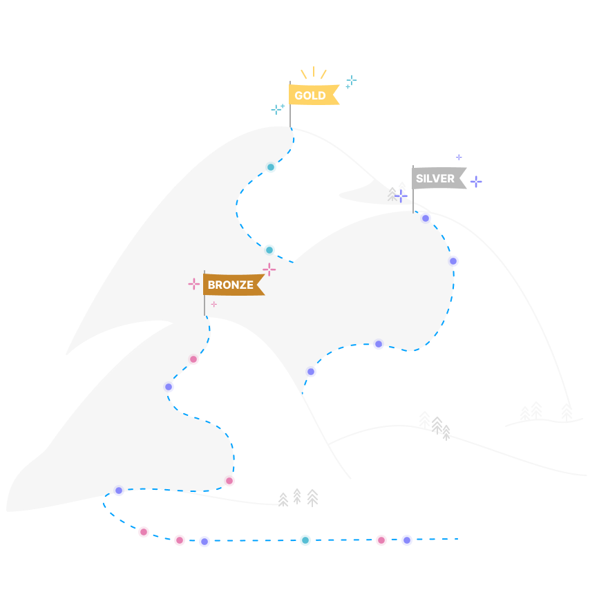
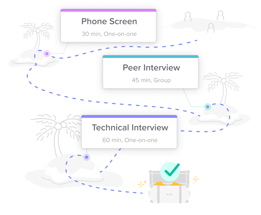
narrative style
A conceptual focus on the benefits of what Calendly can do. This style uses playful and metaphor based imagery designed to compliment the concepts.
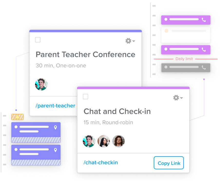
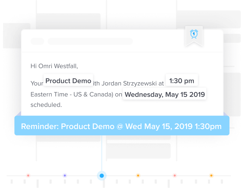
technical style
A detailed explanation of how a feature or workflow in Calendly works. This style brings focus to how the more complex part of the product work.
icon design
The previous icon system used varying line weights and colors. Some icons had different versions for the same goal. To consolidate the usage and style, I created three icon categories based on how and where they would be used on the page.
navigation icon
Used only in menus and tables. Limited detail with two states @16px
feature icon
Used only in content that highlight product features. Some detail with two colors that shift based on feature type @32px.
spot icon
Used in cards and callouts to highlight a small story. Higher amount of detail with flexible color usage @56px.
results
More than a component library, Axiom set up a governance process for adding new components and pages for anyone in the company giving a more polished, and user friendly experience.
conclusion
Collaboration happens best with transparency and clear communication. Using my position as a designer, I could use my skills as a systems thinker help people see the whole picture from all the different perspectives of everyone involved. By making the rules and reasons visible to everyone Axiom helped others do their best work, while improving the quality and efficiency and creativity of the marketing site. As a team, we figured out tailored solutions that met the needs of internal stakeholders and passed those benefits on to the users who visit the marketing website.
special note
Before leaving for graduate school, I was part of the early rebranding process working with Pentagram to re-design Calendly’s brand voice and style. While Axiom no longer exists the lessons I learned in the process of creating it have stayed with me.
acknowledgements
Shout out to Alex Friend, David Rostan, and Brandon Stewart for helping bring Axiom to life.


